
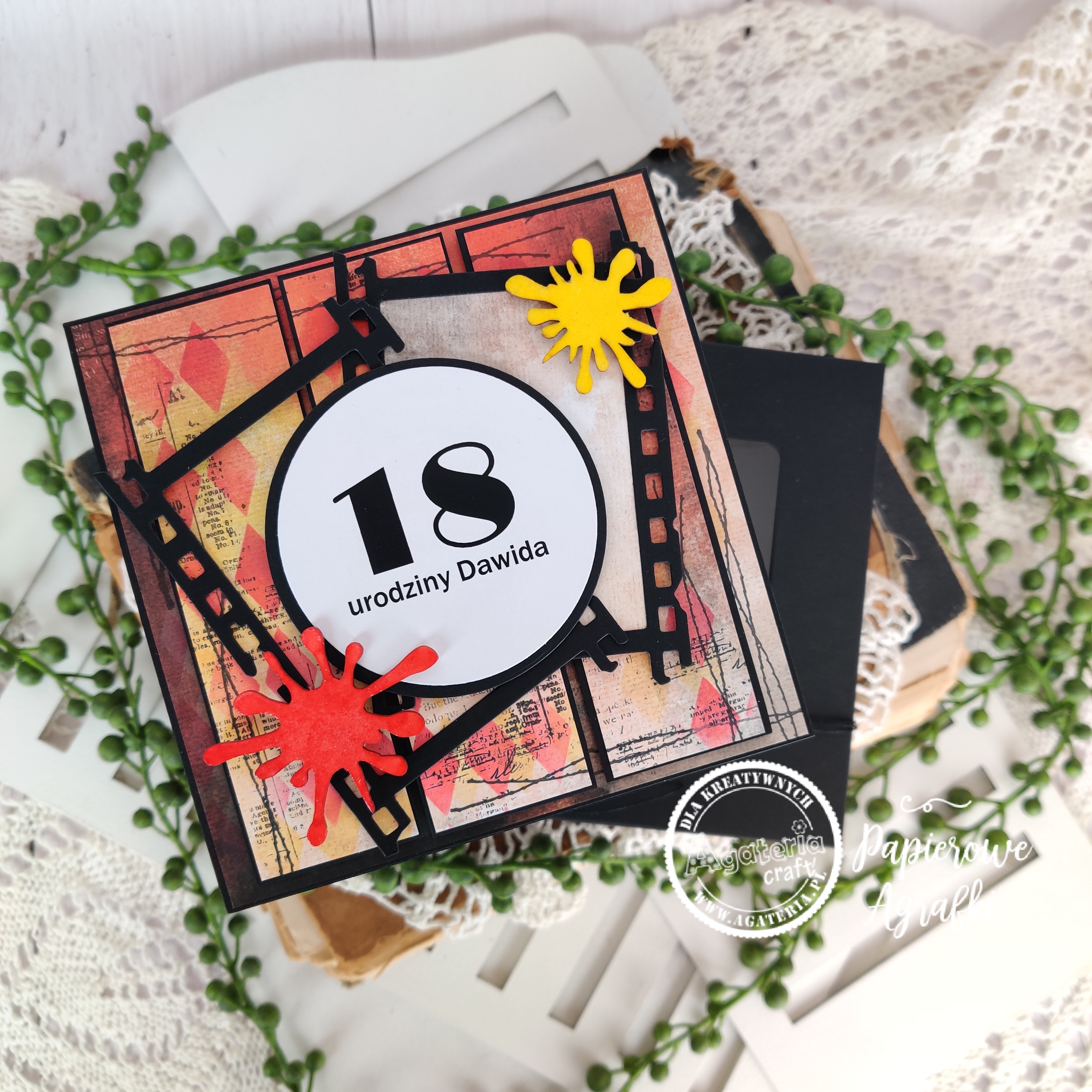
Hej, mimo że sezon komunijny w pełni, ja dziś przychodzę do Was z kartką urodzinową. Projekt ten jest o tyle ciekawy, że jest to kartka męska - a wiem, że dla wielu z Was jest to ciężki temat, to dodatkowo jest to kartka dla chłopaka uwielbiającego malować. Jako, że też jestem artystyczną duszą, postanowiłam trochę się pobawić :)
Hey, even though the communion season is in full swing, today I come to you with a birthday card. This project is interesting because it is a men's card - and I know that for many of you it is a difficult topic, it is also a card for a boy who loves to paint. As I am also an artistic soul, I decided to have a little fun :)

Na początek postawiłam na kolory, chciałam aby kartka była wyrazista. Wybór tu nie był trudny, połączenie czerni, czerwieni o odrobiny żółtego okazało się strzałem w dziesiątkę. Następnym krokiem było pocięcie papieru i wstępne ułożenie warstw. Wierzchnia warstwa to trzy pionowe paski przyklejone względem siebie równolegle na dystansach. Środkowy panel jest podniesiony nieco wyżej od pozostałych aby kartka była bardziej przestrzenna. Zanim jednak skleiłam wszystkie warstwy, trzeba było trochę podkręcić papiery...
At the beginning, I focused on colors, I wanted the card to be expressive. The choice here was not difficult, the combination of black, red and a bit of yellow turned out to be a bull's eye. The next step was cutting the paper and pre-arranging the layers. The top layer is made of three vertical stripes stuck to each other parallel at distances. The middle panel is raised a little higher than the others to make the card more spacious. But before I glued all the layers together, the papers had to be curled up a bit ...


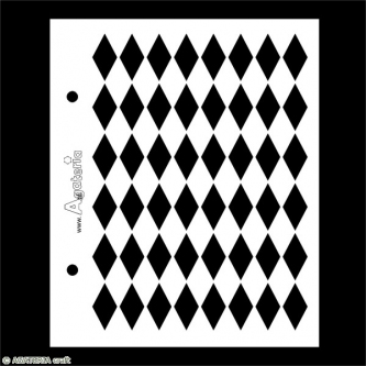
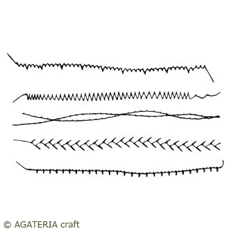
I tu zaczęła się najlepsza zabawa. Za pomocą czerwonego i zółtego tuszu oraz maski rombów naniosłam wzór na papier. Najpierw użyłam tuszu żółtego, następnie lekko przesunęłam maskę przecierając ją tuszem czerwonym. Dzięki temu wzór nabrał głębi. Czynność powtórzyłam tak abym wzór był asymetrycznie na całej kartce. Kolejnym krokiem było odbiecie czarnym tuszem stempla z zestawu przeszyć oraz stempla tła, które również odbijałam asymetrycznie, dzięki czemu efekt uzyskany na kartce jest ciekawszy.
This is where the fun began. Using red and yellow ink and a diamond mask, I applied a pattern onto the paper. First, I used yellow ink, then slightly shifted the mask by rubbing it with red ink. Thanks to this, the pattern gained depth. I repeated the action so that the pattern was asymmetrical on the entire sheet. The next step was to pick up the stamp from the stitching set and the background stamp with black ink, which I also reflected asymmetrically, making the effect on the sheet more interesting.


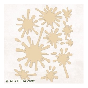
Dla uzyskania większej objętości kompozycji dodałam dwie ramki w formie kliszy, które wycięłam za pomocą wykrojników. Jedną z nich podkleiłam papierem scrapowym. Ramki przykleiłam asymetrycznie. Warstwowo dokleiłam pasujący napis. Przysłowiową kropką nad "i" są tekturki kleksów pokolorowane markerami i zembossowane przezroczystym pudrem.
For a larger volume of the composition, I added two frames in the form of clichés, which I cut out with dies. I glued one of them with scrap paper. I glued the frames asymmetrically. I glued the matching inscription in layers. The proverbial dots above the "i" are cardboard blots colored with markers and embossed with transparent powder.
Użyte materiały


Brak komentarzy:
Prześlij komentarz